Ninth Circuit Upholds “Sign-in-Wrap”–Keebaugh v. Warner Bros.
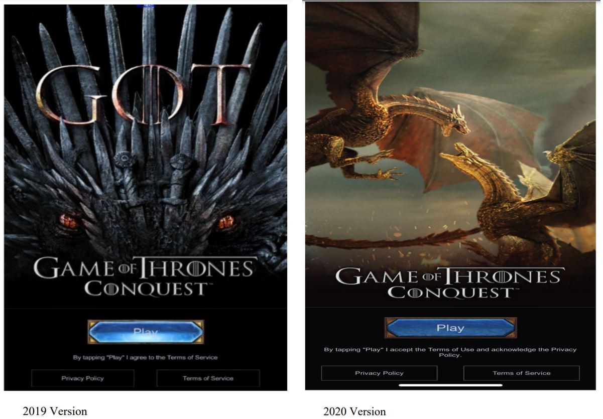
This is a false advertising lawsuit again the mobile app game Game of Thrones: Conquest. The account formation process included a screen where a user could proceed only by clicking on the “play” button:
Warner Bros. sought to send the case to arbitration. The district court disagreed. Warner Bros. gets a more favorable response on appeal to the Ninth Circuit.
The appeals court says this is a sign-in wrap implementation. As such, the court considers the transaction context:
users of GOTC neither purchase the game in the first instance, nor do they have to sign up for an account with Warner Bros. before playing GOTC. But users are notified prior to downloading the game that the app offers in-app purchases, and playing a mobile game with potentially unlimited in-app purchases is unlike buying two tablet devices (Nguyen), purchasing a single flower arrangement (Long), or signing up for a $5 trial (Sellers). There is no time limit imposed by Warner Bros. on how long the user may access the game…
No reasonably prudent internet user—one who is likely often exposed to similar online agreements—would consider downloading and playing a potentially endless mobile game to be equivalent to an insular and discrete one-time transaction….
Users are also made aware via the download screen on the various app marketplaces that GOTC contains in-app purchases, and the users would understand that their use of an app that allows for in-app purchases would be governed by some terms of use.
The old “consumers surely know there’s a TOS somewhere” argument. That’s an approach. Plus, I found this discussion confusing. The court seems to suggest a sliding scale of formation between the transaction duration and the visibility of the terms disclosure, i.e., one-and-done transactions need more conspicuous disclosures than ongoing relationships….?
The court also says the disclosure was sufficiently conspicuous:
Directly beneath the operative Play button is the following: “By tapping ‘Play’ I agree to the Terms of Service” or “By tapping ‘Play’ I accept the Terms of Use and acknowledge the Privacy Policy,” depending on the app’s version. The design elements use “a contrasting font color” making the notice legible on the dark background. As in Oberstein, the notice here “is conspicuously displayed directly . . . below the action button,” the statement “clearly denotes that continued use” will constitute acceptance of the Terms of Service, and the link to the Terms of Service “is conspicuously distinguished from the surrounding text,” by a contrasting white font and emphasized through white borders outlining the hyperlinks. Unlike the notices at issue in Berman, the sign-in screen here lacks clutter and uses “[c]ustomary design elements denoting the existence of a hyperlink.”
Obviously, Warner Bros. could have done better. Use a bigger font. Put the call-to-action above the play button, not below. Best of all, add a second click for the terms.
Also, the district court took issue with the 2020 call-to-action referring to the TOS as “Terms of Use” when it was actually the “Terms of Service.” Ugh, such an avoidable mistake. The court says it’s an immaterial “typographical error”:
Given the prevalence of Terms of Use and Terms of Service in modern society and the frequency they are presented to users, it is clear from the context what was meant by “Terms of Use”
Is it, though? Many sites have multiple overlapping governance documents with similar names, so it’s fair for consumers to expect accurate specificity. Protip: don’t rely on courts to bail you out of unforced errors like this.
Case Citation: Keebaugh v. Warner Bros. Entertainment, Inc., No. 22-55982 (9th Cir. April 26, 2024)
