The Ninth Circuit Has a Lot to Say About Online Contract Formation (Much of It Confusing)–Chabolla v. ClassPass
I previously summarized this case:
The plaintiffs claim they signed up for a ClassPass membership but got unexpectedly auto-renewed. (ClassPass appears to be an aggregator of third-party fitness classes). ClassPass sought to send the case to arbitration based on its TOS
ClassPass pointed to three different screens where it thinks the TOS formed. Here are the three screens in sequence.
Screen 1:

Screen 2:

Screen 3:

In what I thought was a surprise ruling, the district court rejected formation on/across all three screens. The Ninth Circuit, in a divided ruling, affirms.
* * *
For shits-and-giggles, the majority decides to (re?)define the -wrap terminology but use different definitions than the Ninth Circuit articulated in the Nguyen case. The latest Ninth Circuit definitions:
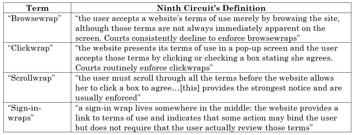
I’ve updated my standard Internet Law slides to reflect these new definitions. Compared to the definitions from Nguyen or the Second Circuit’s Meyer v. Uber opinion, I think these are slightly better. However, the entire -wrap taxonomy is trash and needs to be abandoned.
The majority says ClassPass’ implementation most closely resembles a sign-in-wrap. As usual, the court then discusses standard contract formation principles (conspicuous notice of terms and unambiguous manifestation of assent) to figure out if the TOS is enforceable. In other words, as usual, the -wrap taxonomy did not aid the court at all. 🤷♂️
Notice of Terms
Citing Oberstein, the majority says notice depends on the “context of the transaction, as well as the…visuals involved with the notice, such as font size, text placement, and overall screen design….The nature of the service or goods offered and the visual aspects of every page of a multi-page transaction should be considered together.”
Transaction Context. “A user should expect that certain relationships are bound by terms, even if not explicitly told.” I’d like to know which transactions get that presumption. “Conversely, when a user simply purchases goods or avails herself of a one-time discount offer, there is less reason for her to expect a continued relationship beyond the purchase.” OK, but shouldn’t consumers expect there are governing terms even in those circumstances?
The majority says the screens suggest a continuing relationship, but the screens could also suggest a one-time purchase of credits that, once used, complete the transaction. Because these factoids point in different directions, the majority doesn’t know what to do with them and essentially calls it a coin-toss. In that circumstance, the majority says the vendor has the burden to establish TOS formation, which ClassPass didn’t do (“we cannot find the vague nature of business with ClassPass alerted Chabolla to look for additional terms”). Takeaway: don’t let your TOS formation come down to a coin flip.
Visual Aspects.
Screens 1, 2, and 3 present the Terms of Use by hyperlink within a short one- or two-sentence advisory paragraph written in a small gray font against a white background, with “Terms of Use” and “Privacy Policy” written in blue. For a hyperlink to be reasonably conspicuous, it must be denoted by design elements tailored to notify the reasonably prudent internet user of its presence. In Berman and Oberstein, we indicated that the use of a blue font can be reasonably conspicuous. But there is no bright-line test for finding that a particular design element is adequate in every circumstance. We must instead consider how those design elements appear on the page.
The majority then vigorously scrutinizes each screen.
Screen 1 contains text in varying font sizes and images of people exercising. The user is directed to the action box in the right third of the page and must enter an email to continue. For users (like Chabolla) who enter their email address, the most obvious and natural next step is to click “Continue.” If a user continued to read down the page, they would see an option to “Sign up with Facebook.” The notice of additional terms is found below the “Sign up with Facebook” option, on the periphery of where a user intending to use their email would be looking. A reasonably prudent user would likely click “Continue” and read no further if she had no intention of using Facebook. It is not apparent that a user agrees or commits to anything on screen 1 other than sharing her email address. Here, the notice seems to fade into the irrelevancy of other aspects of the page….
Because of the notice’s distance from relevant action items, its placement outside of the user’s natural flow, and its font—notably timid in both size and color, we find that it is “deemphasized by the overall design of the webpage” and not “prominently displayed” on screen 1.
“Fade to Irrelevancy” might be a good band name. It also might be an accurate characterization of the -wrap taxonomy.
Additional takeaways from this case: your TOS call-to-action shouldn’t use fonts that are “timid” in size or color; and don’t place the call-to-action “outside the user’s natural flow.”
The majority says the TOS call-to-action is placed “more centrally” on Screens 2 and 3. It’s still not good enough:
The notice remains the smallest and grayest on the page, with blue hyperlinks…the transition remains somewhat muddled by language regarding gift cards, which may or may not be relevant to the user’s transaction. A reasonable user could easily assume the notice pertains to gift cards and hastily skim past it.
Another takeaway: don’t place your TOS call-to-action amongst muddled transitions.
Manifestation of Assent
Screen 1 fails because the call-to-action wasn’t sufficient visible. The majority says the calls-to-action on Screens 2 and 3 are “ambiguous.”
On Screen 2, the call-to-action is “[b]y signing up you agree to our Terms of Use and Privacy Policy,” but there is no action button labeled “sign up”–the action button is labeled “continue.” The majority says “It is up to the user to assume that entering a first and last name and clicking the “Continue” button amounts to “signing up”…We find too much ambiguity in screen 2’s language to find that a user binds herself to the Terms of Use by continuing past it.” Another takeaway: your conditional call-to-action “if” statement should precisely match the label of the action button.
Screen 3 doesn’t fare any better. The call-to-action says “I agree to the Terms of Use and Privacy Policy,” and the action button says “Redeem now.” The majority says the unconditional statement “I agree to the TOS” was rejected as a proper call-to-action in Berman. As a result, “screen 3 fails to tell the user the significance of clicking “Redeem now,” and therefore fails to provide the opportunity to unambiguously manifest assent to the Terms of Use.” Another takeaway: calls-to-action must have an if/then structure. If it’s just a “then” statement without any “if,” it’s not enough.
ClassPass argued that the three screens should be considered as one integrated user flow. The majority responds tartly: “three faulty notices do not equal a proper one.” The majority explains:
A reasonable user could infer she “enrolled” in something—a membership, a subscription, an agreement to purchase credits—but the contours of that enrollment are vague, and what the user manifests by enrolling is ambiguous at best. In fact, the website advertises “[n]o commitments.” It is ironic that ClassPass now argues Chabolla unambiguously manifested her commitment to an arbitration clause
Another takeaway: if you say “no commitments,” judges will take great delight in hoisting you with your petard if you try to then impose commitments on consumers. I note that cellphone companies frequently advertise “no contract” as part of their come-ons (when what they really mean to say is that there’s no minimum term to the contract), and this is like nails-on-chalkboard to a contracts law nerd.
Also, if a consumer felt “vague” about what they were buying, I think they would be more likely to check the repeatedly linked TOS to get more details.
The majority summarizes its position:
Neither the landing page nor screen 1 provided Chabolla with reasonably conspicuous notice of the Terms of Use. Even if screens 2 and 3 did, at no point did Chabolla unambiguously manifest her assent to the Terms of Use on those screens. Nor did Chabolla’s use of the website, viewed in total, amount to her unambiguous manifestation of assent to the Terms of Use. Chabolla did not agree to be bound to the arbitration clause within those Terms of Use, so she eludes the Gordian knot that Ross Geller and Chandler Bing struggled against.
I don’t agree with the majority, but they deserve props for the on-point Friends reference. 👏
Judge Bybee’s Dissent
The dissent summarizes his argument:
Katherine Chabolla signed up for a trial subscription with ClassPass for online fitness classes. She entered her name and credit card number, including the expiration date and three-digit CVC number. By the time she had entered her credit card information, Chabolla had navigated three screens, each of which informed her that by continuing and enrolling with ClassPass, she was agreeing to its Terms of Use. Three times Chabolla clicked an action button that was just above or just below the Terms of Use provision. …
ClassPass provided conspicuous notice of its Terms of Use on three separate occasions, and Chabolla unambiguously manifested her assent to those conditions at multiple points in the registration process by clicking either “Continue” or “Redeem now.”…
The screens, considered individually, required Chabolla to manifest her assent to the Terms of Use. When we consider all three screens together, that conclusion is not only inevitable but overwhelming. Chabolla received three conspicuous notices of the Terms and unambiguously assented three times during the sign-up process. For any reasonably prudent Internet user, this was enough to bind her in contract.
With respect to Screen 1, the dissent says: “In deeming Screen #1 unacceptable, the majority decides that a “reasonably prudent Internet user,” someone who in the 2020s sees “Terms of Use” policies everywhere she looks on the Internet, would just breeze past this notice.” Well, actually…consumers do develop “blindness” to these kinds of disclosures, especially if the notices are “outside the user’s flow” as the majority describes it.
Judge Bybee ends on a cautionary note:
The majority’s decision demonstrates that we will examine all internet contracts with the strictest scrutiny and that minor differences between websites will yield opposite results…After today’s decision, a website will have to guess whether any nuance at all in its sign-in wrap will be held against it. The result is one of caveat websitus internetus (roughly translated as “internet websites beware!”). Our decision today will drive websites to the only safe harbors available to them, the clickwrap or scrollwrap agreements. As a policy matter, that may be a perfectly acceptable landing place, but it is not the landing place that we have approved in the past, and we are neither the Congress nor the California State Assembly.
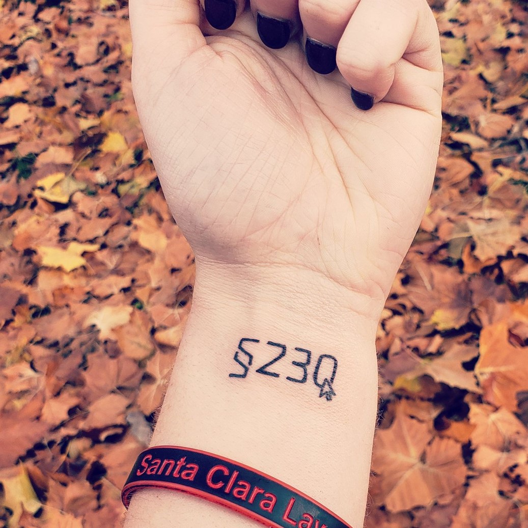 “Caveat websitus internetus” sounds a little like a wizarding spell in Harry Potter. Not as lethal as “Avada Kedavra,” but more powerful than “Expelliarmus.” The phrase would be a rad band name–but not a great one because it would be hard to pronounce and spell. If you’re looking to ink an Internet Law deep cut of trivia on your body, “caveat websitus internetus” might be an interesting tattoo choice. (“Section 230” has already been done).
The dissent says that courts “will examine all internet contracts with the strictest scrutiny,” and I think that’s accurate. I’ve noticed over the last few years that courts have become increasingly unforgiving of even the tiniest mistakes in TOS formation or amendment. As the litigators might say, “govern yourself accordingly.”
The dissent also says: “Our decision today will drive websites to the only safe harbors available to them, the clickwrap or scrollwrap agreements.” Perhaps, but is this really new? For example, in Oberstein, the Ninth Circuit warned: “while Appellees’ Terms meet the reasonably conspicuous standard, this hybrid form of agreement is not without its risks and invites second-guessing. To ensure that an online agreement passes muster, clickwrap is the safest choice.” Thus, I feel like the courts have been pushing websites towards the “clickwrap” “safe harbor” for years. If so, this opinion just reinforces that’s where we are. Another takeaway: if you are still using one-click formation processes instead of two, you’re implicitly opting-out of the TOS formation “safe harbor” the courts have identified–for better or worse.
Implications
I disagree with the majority’s ruling. Based on the precedent, I think each of the screens should form a contract despite the shaky aspects of each screen.
At the same time, I don’t have a lot of sympathy for ClassPass. They had 3 different chances to get it right, and each time they cut just enough corners to leave them exposed. As the majority indicates with the coin flip, the burden is on ClassPass to form the contract. ClassPass surely could have done better. Its formation process should have been so overwhelmingly clear that it leaves nothing to chance/a coin flip. Especially with Screen 3’s checkout page, adding one additional click there would have minimal impacts on conversion.
The majority opinion is filled with citable lines that I expect will show up frequently in other opinions, so you should probably read the whole thing. For your convenience, I restate some lessons offered by the majority opinion:
- Don’t let your TOS formation come down to a coin flip. This is a situation where you should be shouting, not whispering.
- Your TOS call-to-action shouldn’t use “timid” font sizes or colors.
- Your TOS call-to-action should be located within “the user’s natural flow,” not outside.
- Don’t place your TOS call-to-action amongst muddled transitions.
- The call-to-action “if” statement should precisely match the label of the action button.
- Calls-to-action need an if/then structure. A “then” statement without the “if” isn’t enough.
- Don’t market your offering as having “no commitments” to consumers unless you really, really mean it.
- A one-click formation process means you’re not taking advantage of the TOS formation “safe harbor” provided by a two-click process.
I don’t think any of these lessons are new, but perhaps seeing them in one place will prompt you to review, and where appropriate uplevel, your TOS formation process.
Case Citation: Chabolla v. ClassPass Inc., 2025 WL 630813 (9th Cir. Feb. 27, 2025)
* * *
In a similar vein: Massel v. SuccessfulMatch.com, 718 F.Supp.3d 1112 (N.D. Cal. Feb. 27, 2024)
Because Millionaire Match’s links were underlined but did not appear in a contrasting color, the Court must conclude, under Berman, that they were not reasonably conspicuous enough to put Mr. Massel on notice of the terms….This conclusion is bolstered by the fact that other links on the signup page appear in all capital letters while the links to the Service Agreement and Privacy Policy are in title case. These distinctions may seem picayune, but website operators like Millionaire Match have ultimate control over their design decisions. Nothing requires them to present terms as subtle hyperlinks to separate pages instead of, say, requiring users to scroll through the actual terms before signing up
In other words, scrollwrap or it’s crap. 🤷♂️