Coursera Wins a TOS Formation Battle, But With Heavy Losses–Ghazizadeh v. Coursera
This is a VPPA case 🙄. Coursera invoked the arbitration clause in its TOS. It gets the arbitration it wanted, but via a messy opinion that does not represent a clean approval of its TOS management practices. Check out how many potential points of failure it had to navigate.
Initial TOS Formation
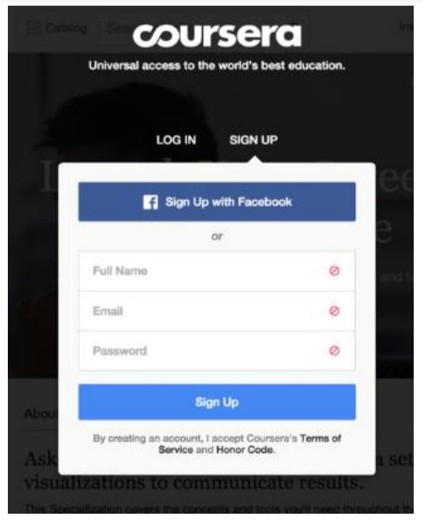
In 2015, the named plaintiff clicked through this screen:
Looks like a standard sign-in-wrap (ugh) to me. Coursera argued it was a “hybrid sign-in-wrap” (UGH). The court says it’s “most like a ‘modified clickwrap agreement’ or ‘sign-in wrap.'” (What does “modified clickwrap” mean? UGH).
Once again, all of the -wrap classification discussion proves to be irrelevant:
regardless of how the 2015 Sign-Up Screen is categorized, “ultimately the same inquire [sic] notice test applies because ‘it is the degree of notice provided, not the label, that is determinative.’”
So we’re back to first principles of contract formation. The court starts with whether Coursera provided reasonably conspicuous notice of the terms, following closely the tests articulated in Berman and Sellers.
Transaction Context. “Coursera is more like the mobile game app in Keebaugh than a ‘one-and-done’ traditional website….users of Coursera’s services, a platform that offers online educational courses via pre-recorded videos, would similarly expect (or should expect) their access to the platform would be continual and governed by some terms of use.”
[Nomenclature note: I’ve noted a rise in judges’ use of the term “one-and-done.” To me, it feels like a way of eliding more complex issues. In this context, some websites and services may not contemplate or care about repeated patronage, but those are rare and the “one-and-done” framing becomes inaccurate and insulting.]
Notice Visibility.
Plaintiff contends that the notice language here is not as conspicuous as it could be. The Court agrees. Coursera could have used underlining, blue coloring, all capital letters, or a larger font. But those features are not dispositive, and courts have enforced arbitration agreements where hyperlinks were conspicuous even without blue font or capitalization.
So the court favorably cites the bolding of “Terms of Service,” the call-to-action placement “directly” below the action button, and that the screen is “simple and lacks clutter.” As a result, “the darker and bolded text of the hyperlinked ‘Terms of Service’ adequately contrasts with the light gray background.”
(Use a second click in the TOS formation process and you can avoid all of this judicial pixel-policing).
Assent. The court talks about the importance of phrasing the call-to-action correctly:
Courts have found no assent where, considering the overall design of the page, there was a discrepancy between the action button and the text of the notice….courts have found unambiguous consent despite mismatched language where the disclosure of the notice was located immediately adjacent to the action button
Here, Coursera’s call-to-action refers to “creating an account,” but the action button says “Sign up.” This is a minor mistake, but it is a mistake nonetheless because it gives a judge an excuse to invalidate everything. Never rely on a court’s sympathy for minor mistakes in the TOS formation process.
Fortunately, it works out for Coursera. The court says: “despite the discrepancy in language, there can be no reasonable dispute that Plaintiff assented to the terms of service by clicking ‘Sign Up.'”
After 21 pages, the court finally says that Coursera validly formed its TOS in 2015.
The TOS Amendments
That’s not enough to get the case to arbitration. Coursera putatively added the mandatory arbitration clause in a 2020 amendment. That means Coursera has to show how the plaintiff agreed to the amendment.
The TOS contained the following amendment provision:
We reserve the right to revise the Terms at our sole discretion at any time. Any revisions to the Terms will be effective immediately upon posting by us. For any material changes to the Terms, we will take reasonable steps to notify you of such changes. In all cases, your continued use of the Services after publication of such changes, with or without notification, constitutes binding acceptance of the revised Terms.
Coursera tries three different ways to make its arbitration amendment stick. It only needed one way to succeed, and it gets that, but the two failures are troubling.
Email Notice of the Amended Terms
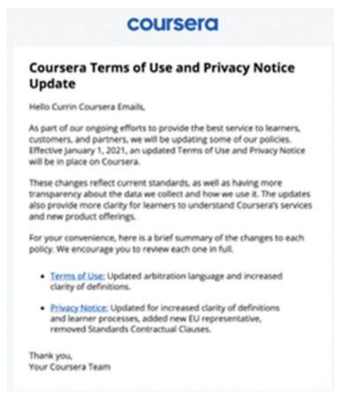
“Coursera emailed all users to inform them of forthcoming updates to its TOU, including updates to the Arbitration Agreement, effective January 1, 2021.” The subject line: “Terms of Use and Privacy Notice Update.” The text included the following:
As part of our ongoing efforts to provide the best service to learners, customers, and partners, we will be updating some of our policies. Effective January 1, 2021, an updated Terms of Use and Privacy Notice will be in place on Coursera….
For your convenience, here is a brief summary of the changes to each policy. We encourage you to review each one in full.
• Terms of Use: Updated arbitration language and increased clarity of definitions.
Here is a screengrab of the email notice:
“Coursera produced a declaration from its Senior Vice President for Engineering who testified that Coursera’s records show that an email with the subject line “Terms of Use and Privacy Notice Update” was delivered to Plaintiff’s email address on December 18, 2020.” The court doesn’t actually mean “delivered.” The court says the email was “sent” and provides this detail (the grammar error is in the opinion): “Plaintiff’s counsel provided Coursera with Plaintiff’s email address, and a Coursera engineer used a Coursera engineer used [sic] that information to identify Plaintiff’s account.” The court says that’s enough to put the burden on the plaintiff to disprove receipt, which the plaintiff can’t do. With this slightly better evidence of sending the notification, the court distinguishes the Sifuentes case without expressly acknowledging that it’s using a different burden allocation. Given the lower courts’ different approaches to whether or not an email amendment notice works when the plaintiff says they didn’t get it, I assume this issue will go to the Ninth Circuit again.
(Also, people sometimes forget that UETA and E-Sign discussed the differences between electronic documents being sent and delivered).
The court says Coursera’s process provided reasonable notice to the plaintiff:
the language in the email is reasonably conspicuous because the header clearly states that the email included updates to the TOU, the TOU hyperlink is in blue font and stands out from the remaining text, and the hyperlink is followed by a description of the TOU which specifically calls out “[u]pdated arbitration language.”…
Plaintiff’s consent to the 2015 TOU, which contained a “continuing use” provision, combined with Plaintiff’s continued use of Coursera’s services, is sufficient to demonstrate manifestation of consent to the updated terms sent directly to the email address Plaintiff had on file with Coursera
The “continuing use” phrase refers to a call-to-action of how users accept the amendments. Coursera’s TOS said they accept by continuing to use the website. Other courts would find Coursera’s approach too self-serving and would demand a more traditional method of acceptance, like another click.
“Banner” Notice
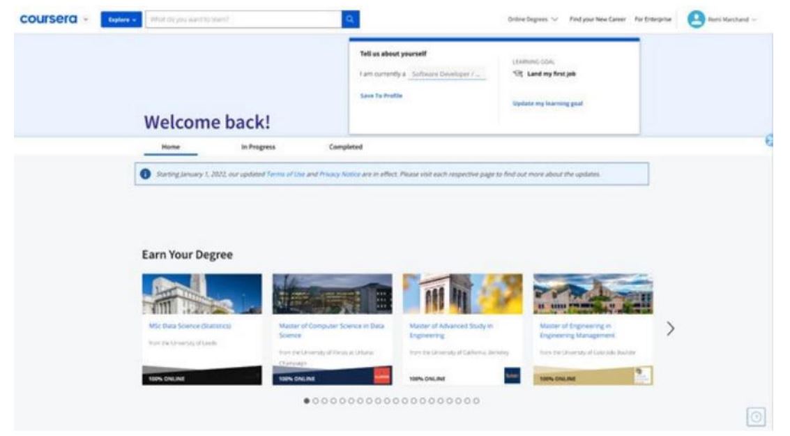
Coursera also displayed notice of the amended terms on its website. This is the banner they displayed in 2022 (apparently Coursera didn’t introduce a screengrab of the 2021 banner as evidence–seriously? Why not?):
The fact you can barely find the banner in this screenshot is part of the problem. The court says the banner didn’t work:
The banner is shown in a light blue box near the top of the webpage that blends in somewhat to the background of the webpage, and the font appears smaller than the surrounding font. Additionally, the hyperlinked terms, although blue, appear within the banner which itself appears among a fairly cluttered webpage.
If you’re making an onsite disclosure of amended terms, that’s not the time to be subtle. Otherwise, at best, you’re wasting your time, and at worst, your amendment process will fail and your TOS doesn’t say what you think it says.
2022 Course Enrollment
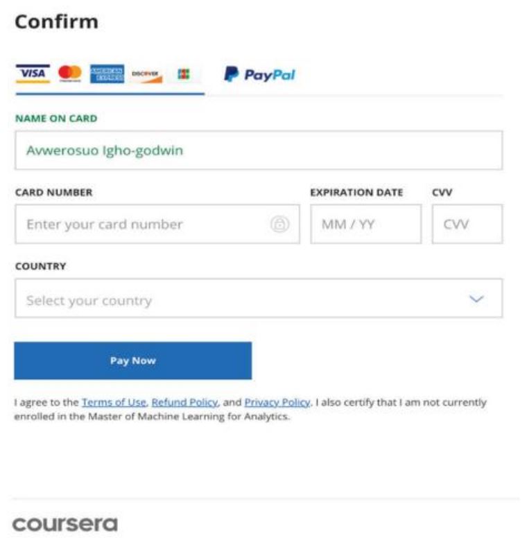
The named plaintiff enrolled in a course in 2022, which also required them to agree to the TOS:
 (Avwerosuo Igho-godwin is a European software engineer, but not obviously working for Coursera, so I’m not sure how they got dragged into this).
This prompts the court to do a bonus round of Berman analysis. What fun. The court says the e-commerce formation process did not work:
the 2022 Checkout Flow satisfies the visual requirements to provide conspicuous notice that a reasonably prudent internet user “would have seen” the hyperlink and be able to locate the TOU. The TOU hyperlinks are blue, underlined, and located directly below the “Pay Now” button…
the Court is less convinced that Coursera could rely on the 2022 Checkout Flow standing alone to establish unambiguous consent. Unlike the 2015 Sign-Up Screen, which specifically noted that by taking some action (creating an account), the user would accept Coursera’s terms of service, the 2022 Checkout Flow as presented to the Court lacks any similar advisement. Plaintiff’s click of the “Pay Now” button can be construed as unambiguous manifestation of assent “only if [Plaintiff] is explicitly advised that the act of clicking will constitute assent to the terms and conditions of an agreement.” Berman, 30 F.4th at 857, 858 (“[T]he notice must explicitly notify a user of the legal significance of the action she must take to enter into a contractual agreement”). Although courts have found unambiguous manifestations of consent even where the language between the button and the notice is not an exact match (e.g., notice lacked an advisement that by clicking the button, or taking some action, the user was consenting to the terms. This lack of advisement makes the 2022 Checkout Flow more like the notice Berman found did not constitute assent, where the webpage simply presented a continue button with a statement below reading “I understand and agree to the Terms & Conditions,” without reference to the impact of any particular action.
Oof. I don’t know how much Coursera relies on the e-commerce process as its main TOS formation process, but this court seemingly wiped away most of those. Further, given the ubiquity of similar screens on the Internet (years after the Berman ruling), this conclusion is a reminder that your e-commerce checkout screen’s TOS formation may not be working the way you think it does.
The no-TOS conclusion allows the court to sidestep some of the complex questions that arise if the formation had worked, such as whether the TOS agreement in 2022 amended the 2015 TOS, created a second contract in parallel with the initial TOS, or something else. The messy Nicosia v. Amazon litigation comes to mind.
* * *
The net tally: Coursera successfully formed its TOS in 2015 and amended it via email notification in 2021, but it could have done better. It should have used a 2-click formation process, it needed the court to excuse its call-to-action discrepancy and lack of underlining, and it needed the court to endorse its email notice by bypassing the Sifuentes line of cases. Worse, Coursera’s on-site banner and the 2022 e-commerce page both failed as formation processes.
So Coursera got the result it wanted, but it is not exactly in a position to take a victory lap. I trust Coursera will be reviewing all of their TOS formation processes in light of this ruling and revamping many of them. You might take this opportunity to do the same.
Case Citation: Ghazizadeh v. Coursera, Inc., 2024 WL 3091968 (N.D. Cal. June 20, 2024)


