Another Roundup of Online Contract Formation Cases
Time for another roundup of online contract formation cases.
HomeAdvisor, Inc. v. Waddell, 2020 WL 2988565 (Tex. Ct. App. June 4, 2020)
The court finds this a valid contract formation process:
 The court explains:
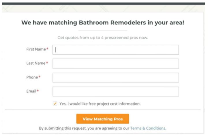
the submittal page was uncluttered, with only a few spaces to enter information, and a large orange submit button with the phrase “By submitting this request, you are agreeing to our Terms & Conditions” written directly underneath. The text with the hyperlink to the terms and conditions is dark against a bright white background, clearly legible, and the same size as the nearly all of the text on the screen. The entire screen is visible at once with no scrolling necessary. The hyperlink may be clicked, and the terms of the agreement may be viewed, before the user submits a request for service. Although the terms of service are lengthy, the arbitration provision is prominently noted with bolded and capitalized print. There is nothing misleading or confusing about HomeAdvisor’s presentation of its user agreement. Similar presentations have consistently been found to be conspicuous and to put the website user on inquiry/constructive notice of the website’s terms of service. Indeed, more cluttered and complicated sign-in-wrap screens have been found to provide sufficient notice. Accordingly, we conclude HomeAdvisor’s submittal screen gave appellees reasonably conspicuous notice of the company’s terms of service, including the arbitration provision….
appellees’ assent to HomeAdvisor’s terms of service was unambiguous as a matter of law. The mechanism for manifesting assent – clicking the submit button – is temporally coupled with the website user’s receipt of the company’s services and the user is clearly advised that clicking the submit button indicates such assent. In other words, the reasonably prudent user would have understood that they could only receive HomeAdvisor’s referral services by agreeing to the company’s terms and conditions
Overall, a good result for HomeAdvisor. HomeAdvisor could have easily done better, including putting the call-to-action above the orange button, increasing its font size, and linking the orange button action to the call-to-action–or better yet, adding a mandatory checkbox on the call-to-action requiring approval before the orange button becomes active.
Acaley v. Vimeo, Inc., 2020 WL 2836737 (N.D. Ill. June 1, 2020)
Despite some dubious implementation decisions, the court upheld contract formation:
Acaley received reasonable notice on at least two occasions that his use of the Magisto app constituted assent to its terms of service. First, he received such notice when he initially opened the app and viewed its welcome page, where, as indicated, the following statement appeared: “By continuing I agree to the terms.” This statement, like the one that appeared on several webpages in Hubbert, would place a reasonable person on notice that there were terms and conditions connected to his or her continued use of the app. In addition, Acaley received reasonable notice that he was assenting to Magisto’s terms of service when he signed up for the free subscription plan trial via a web browser on his iPad. As indicated, he accessed a webpage that featured a button with the text “Create account” and, directly below that, in smaller but still conspicuous font, displayed a statement that read: “By starting you agree to our terms and privacy policy,” with hyperlinks to the respective documents. That statement would put a reasonable person on notice that there were terms and conditions connected to the creating an account.
The plaintiff attacked the clarity of the call-to-action, but it was good enough:
he asserts that the statement “By continuing I agree to the terms” mirrored the language only of the “Continue with Facebook” button, not of the “More options” hyperlink that he clicked. He contends a person in his shoes would not have understood that clicking the hyperlink constituted assent to the terms. But though the language certainly could have been more precise, a reasonable person would have understood that the “More options” hyperlink provided more options for continuing to use the app and that continued use of any sort amounted to assent to the terms of service. This understanding immediately would have been confirmed by the window that appeared after a person clicked “More options”: its heading read, “Continue with” and, directly below that, it listed several ways that a person could continue to use the app….
He asserts that, due to the website’s inexact language, someone in his shoes would not have known that clicking the button to create an account with Facebook constituted “starting” to use the program and thus accepting the terms. That contention also stretches too far. A reasonable person would understand that the word “starting” referred to the creation of an account—indeed, there appears to have been no way to start using the Magisto from that page without creating an account—and that by using Facebook to create an account he or she was accepting the terms of service.
Wow, it would be so easy to fix all of this. Your call-to-action should be in the form of an “if x, then y” statement, where X refers to the action button on the page or, better yet, a stand-alone mandatory checkbox.
The good news for the defense ran out, because the court held that the plaintiff’s BIPA claim wasn’t within the TOS scope.
Berman v. Freedom Financial Network, LLC, 2020 WL 5210912 (N.D. Cal. Sept. 1, 2020)
The TOS arbitration clause failed. The defense has a problem getting the right evidence into court:
Bhadania very generally explains how he “recreated” the set of multiple webpages each plaintiff would have seen when they visited the websites based on a unique visitor ID generated for each session, and “regenerated images” of the webpages. The exhibits submitted by Bhadania are the equivalent of blank form contracts, with no clear indication that these plaintiffs agreed to them. Fluent elected to omit other pages from the multiple page “flow” for these website visits which might have demonstrated that these particular users interacted with these particular pages. Given that plaintiffs each submit declarations disputing seeing elements of these pages, and defendants failed to provide complete information to authenticate the exhibits, the Court finds that there are material facts in dispute.
Remember, when forming your online contract, you need the right substantive terms, the right formation process, and the right evidence to prove both. As I tell my students, assume that all of the people who worked on the contract have left the company by the time the case gets litigated.
Then, the court says these pages don’t clearly indicate assent to the TOS.

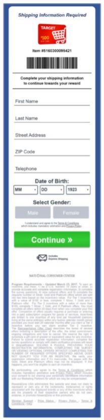
The court explains:
There is no tickbox or “I agree” button for the Terms & Conditions. As in Nguyen, the hyperlink to them is only located in proximity to button with which the user must interact to continue. The “This is correct, Continue!” and “Continue” buttons plainly refer to the entry of other information on the page, not assent to the Terms & Conditions. Although the user must interact with the page and click a button to continue using it, that click is completely divorced from an expression of assent to the Terms & Conditions or to mandatory arbitration. Further, the phrase “I understand and agree to the Terms & Conditions which includes mandatory arbitration and Privacy Policy” is formatted in black font against a white background which is exceedingly small compared to the larger, more colorful and high-contrast fonts on the rest of the page, making it difficult to read on a large, high-resolution monitor, much less a mobile device. That the very small text providing the hyperlink to the Terms & Conditions also uses the words “which includes mandatory arbitration” does not change the analysis since the website does not prompt affirmative assent to this statement.
So much failure, yet so avoidable. The call-to-action language wasn’t sufficiently linked to the desired action, and the call-to-action was too small and visually indistinct. Good rule of thumb: the call-to-action font should be the same size as the biggest font elsewhere on the page. I’m sure you can do better than these defendants did.