Tubi’s TOS Formation Fails–Campos v. Tubi
This is a Video Privacy Protection Act (VPPA) case 🙄 against the video streaming platform Tubi. Tubi sought to send the case to arbitration per its TOS. The court says no.
The account signup page on mobile devices looked like this (Screen 1):
Note the unusual “skip” link in the upper right–what happens if users select it?
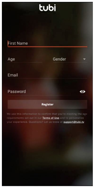
If users select “continue with email,” as the court assumes the named plaintiff Campos did, they see this (quite ugly) Screen 2:
What is that background? Blurred out porn?
As usual nowadays for TOS formation cases, the court starts by getting the -wrap nomenclature out of the way:
it is unnecessary to expound on [the wrap nomenclature] in much detail or find a perfectly fitting category here. To clarify the parties’ dispute, Tubi’s registration page fits most closely with the hybridwrap or “sign-in-wrap” camp. Nonetheless, the Court’s duty to inquire into the reasonableness of Tubi’s presentation of its terms and whether Campos objectively assented to them remains unchanged; the basic principles of contract law do not apply differently depending on the type of “wrap” at issue
“Hybridwrap” is another way of saying that the ubiquitous and “well-accepted” -wrap taxonomy is a complete failure. A taxonomical node of “none of the above” would also be accurate.
Turning to the merits, the court concludes that “Tubi has not established that it reasonably communicated the existence of its TOU to Campos.” The court identifies three main problems.
First, the call-to-action has poor visibility:
The Prompt is in the smallest font on the screen, and it is very nearly at the bottom. The relevant text of the Prompt, “By registering, you agree to Tubi TV’s,” is in a gray font that contrasts poorly with the background. To be sure, a user does not seem to need to scroll to see it, a fact that favors Tubi’s position.
I invoke Goldman’s Fourth Rule of Acquisition: the call-to-action should never be the smallest font on the screen (though, to be fair, the words “Have an account?” look slightly smaller).
Second, the court doesn’t like the hyperlink presentation on Screen 1, especially the gray font on a black background:
the hyperlink to its TOU is not reasonably visually conspicuous…The cases and screenshots in Tubi’s Exhibit 1 each involve more conspicuously displayed hyperlinks than Tubi’s TOU hyperlink on the initial registration page at issue here
Third, and perhaps most importantly, the call-to-action is spatially decoupled from the registration:
a reasonable user registering for a Tubi account would not be expected to read [the “Prompt”/call-to-action]. This is because the Prompt on the first screen is not spatially coupled with any mechanism for manifesting assent. Nothing on the screen indicates that clicking one of the “Continue with…” buttons manifests assent to the terms of use; to the contrary, the Prompt indicates that some other action—registering—is required to assent to the TOU. And there is nothing on the first screen of the app that tells one how to register…the Prompt and the manifest assent button (“Register”) are not even on the same screen. Moreover, the prominent and colorful “Continue with…” buttons would be of much more interest and relevance to a prospective Tubi user than would the small and obscure text at the bottom of the first screen. Having been invited to “Continue with” their exploration of the app, it is unlikely that Campos or others would have expected or noticed the “Terms of Use” prompt on the first screen advising that registration (which is otherwise unmentioned on the first screen) equals assent…
That Tubi’s Prompt is on a different screen than the registration button, coupled with the absence of any warning on the registration page that registration equates to assent, weighs heavily against a finding that Tubi reasonably presented the existence of its TOU to Campos
There are several interrelated problems here:
- The call-to-action refers to an action that the user can’t take on that screen. It doesn’t make any sense to me to split up the call-to-action and registration page, so I can’t defend this practice.
- The call-to-action is located below the action button, not above.
- It’s unclear what happens if users “register” by continuing with Google or Facebook, creating possible holes in the formation process for users who choose those options. I’m also still stuck on what happens if someone selects the “skip” option.
Tubi easily could have avoided these problems. If Tubi had repeated verbatim the call-to-action on the email registration page, it would have been OK in this case (that still wouldn’t address the Google/Facebook bypasses). Even better, if Tubi had included a mandatory checkbox to accept the TOS or an interstitial screen dedicated solely to the TOS, it would have easily succeeded. Rulings like this are why I keep insisting that a proper TOS formation process should have a dedicated click for the TOS, in addition to any clicks associated with proceeding.
As a last-ditch measure, Tubi argues that all consumers assume that services have TOSes. It doesn’t help:
Tubi does not require users to register for an account to watch its content, registration only provides a handful of modest features that are unavailable to unregistered users, and registration is free. There is no indication that Tubi, like various other ad-supported video streaming platforms, allows registered users to comment on its content, generate their own content (e.g., upload their own videos), or otherwise interact with other users—functions that may suggest that account usage may be tied to certain terms and conditions given their hazards. Therefore, Tubi’s site is meaningfully different from other online engagements where consumers may more reasonably expect their conduct and interactions to be subject to terms and conditions (e.g., purchasing goods, paying fee-based subscriptions to access content, or registering accounts for permission to interact with content and/or other users)
 Last month, I blogged two cases where courts found enforceable browsewraps (though one was actually a clickthrough) (1, 2). (A reminder: the term “enforceable browsewrap” should be an oxymoron). It is virtually impossible to reconcile those rulings with this one. In particular, one of those rulings, Hawkins v. CMG, also involved a VPPA claim where the court found a successful TOS formation–without any call-to-action at all! The page just linked to the terms, and users were supposed to figure it out. Cut corners on your TOS formation process, and maybe you’ll roll a lucky 7 like CMG did–but you could also roll snake-eyes like Tubi did. Use a 2-click formation process (one click for the TOS, one click to proceed), and you are more likely to sleep soundly like this Cuban dog.
The court also rejects the motion to dismiss the VPPA claim for reasons that made my head hurt. The plaintiff cited disclosures in Tubi’s privacy policy as evidence of Tubi’s VPPA violations, but at the same time the plaintiff’s position is that those disclosures were insufficient to get consumer consent. I’m not really sure how that works. 🤷♂️
Case Citation: Campos v. Tubi, Inc., 2024 WL 496234 (N.D. Ill. Feb. 8, 2024). Yesterday, Tubi appealed this ruling to the Seventh Circuit.


