Uber’s Contract Formation Process Fails (Again)–Cullinane v. Uber
 The plaintiffs allege Uber made overcharges or improper surcharges. Uber moved to compel arbitration. The district court granted the motion, despite the lack of a leakproof contract formation mechanism. (Blog post mentioning the district court ruling here: “Courts Approve Terms of Service-Based Arbitration Clauses for Uber and Groupon”.) On appeal, the First Circuit reverses.
As with most other courts to have addressed the issue, a Massachusetts appellate court held that traditional contract principles need not be modified when analyzing online agreements. The question is whether online terms have been reasonably communicated and accepted by the consumer. In a footnote, the court says that the existence of an arbitration clause does not change the analysis.
Uber didn’t argue that the users in question clicked on or read the terms. Rather, the argument is that the terms were reasonably conspicuous such that consumers should be charged with knowledge. The key question is whether the terms are “conspicuous,” and this is one of reasonableness. Things that make something conspicuous (citing Meyer v. Uber):
- Use of a larger font
- Use of contrasting font
- use of headings in capitals
- whether the text is set off
Where the agreement is linked, the description of the link is also relevant.
Applying these factors, the court says that Uber’s terms were NOT reasonably communicated. The court:
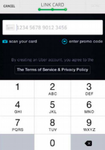
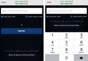
note[s] at the outset that Uber shoes not to use a common method of conspicuously informing users of the existence and location of terms and conditions: requiring users to click a box stating that they agree to a set of terms, often provided by hyperlink, before continuing to the next screen.
The court says the terms lack conspicuousness for several reasons:
- they don’t look like typical hyperlinks (“blue and underlined”)
- the font size and colors for the terms were similar to what was used for other parts of the transaction (such as “scan your card” and “enter promo code”)
- the phrase alerting users that they’re agreeing to the terms is smaller and less prominent than the links to the terms themselves
The court helpfully provides screenshots:
As Eric’s post on the Ramos case mentions, Uber’s contract-formation process has been subject to repeated attacks, and it has achieved mixed results. The Second Circuit upheld a similar iteration of Uber’s contracting process in the Meyer case. The First Circuit does not explain why it reaches a result different from the Second Circuit, and Meyer only warrants a brief, passing mention in this opinion.
One explanation is that it comes down to the courts differing standards for when something is reasonably communicated. The Second Circuit looked to the modern consumer who downloads apps and knows generally that apps have terms attached to them. The First Circuit does not give Uber the benefit of this presumption. The ruling (along with Meyer) illustrates the challenges that arise when courts evaluate whether something is conspicuous.
As the court notes, it’s painfully easy to get the contract formation right. Yet companies—even sophisticated ones—screw it up. I bet this would happen less often if lawyers who draft the terms are required to actually go through the online process.
Eric’s Comments:
* The 2nd Circuit’s Meyer case applied a “reasonably prudent smartphone user” standard for contract formation, without any empirical evidence defining those consumers’ expectations. As Venkat notes, this legal standard has become fertile soil for judicial anarchy. The different results between this case and the Meyer ruling might possibly be explained by slight differences in the user interface over the years. More likely, it’s just the judges going with their guts.
* In a footnote, the court denigrates the importance of the clickwrap/browsewrap distinction, saying “our analysis regarding the existence of an arbitration agreement is not affected by how we categorize the online contract at issue here.” If you’re all wrapped up in trying to navigate the -wrap taxonomy….
* The court says “If everything on the screen is written with conspicuous features, then nothing is conspicuous.” This is codeword for saying that the court wants to see the contract call-to-action in bigger font than other words on the screen and with enough visual distance from other screen widgets.
* Or, at this point, you should add an extra checkbox to your contract formation process where users indicate they accept the user agreement. Since the Nguyen case’s mishandling of the clickwrap/browsewrap definitions, courts have raised the bar to require two clicks for contract formation. Give the courts what they want. The stakes are too high to make any mistakes on this point.
Case citation: Cullinane v. Uber Techs., 2018 WL 3099388 (1st Cir. June 25, 2018)
Related Posts:
More Bad News for Uber’s Contract Formation–Ramos v. Uber
Uber’s Contract Upheld in Second Circuit–Meyer v. Uber
Faulty Mobile Device User Interface Jeopardizes Uber’s Contract Formation–Metter v. Uber
Courts Keep Shredding Online Contract Formation Processes–McGhee v. NAB; Applebaum v. Lyft
Ninth Circuit Sends Uber Driver Claims to Arbitration
Anarchy Has Ensued In Courts’ Handling of Online Contract Formation (Round Up Post)


