Second Circuit Says More About the “Reasonable Internet User” Standard for TOS Formation–Edmundson v. Klarna (Catchup Post)
[I missed this opinion when it first came out in 2023. Blogging for completeness because of the importance of the “reasonable Internet user” standard.]
Klarna offers a “buy now, pay later” option to consumers at third-party e-commerce sites. If a consumer chooses to pay with Klarna, it divides the bill into 4 equal amounts and debits the consumer’s bank account every 2 weeks until paid. Klarna doesn’t charge consumers any interest or other fees; I assume the merchant pays Klarna a cut (just like the merchant would have to pay credit card processing fees). If the consumer doesn’t have money in their account when the debits come through, then the debit may trigger the bank’s overdraft fees–which accrue to the bank, not Klarna. The plaintiffs in this case claim that Klarna didn’t adequately disclose the risk of overdraft fees (which might dwarf the actual fees owed to Klarna). Klarna invoked its arbitration clause in its TOS. The lower court denied arbitration, but the Second Circuit reversed.
The court first defines a reasonably prudent device user, who “is not a complete stranger to computers or smartphones, having some familiarity with how to navigate to a website or download an app….A reasonably prudent internet or smartphone user is on inquiry notice of contractual terms where the terms are presented in a clear and conspicuous way.”
The court says the following formation screen (called the “Widget”) succeeded:
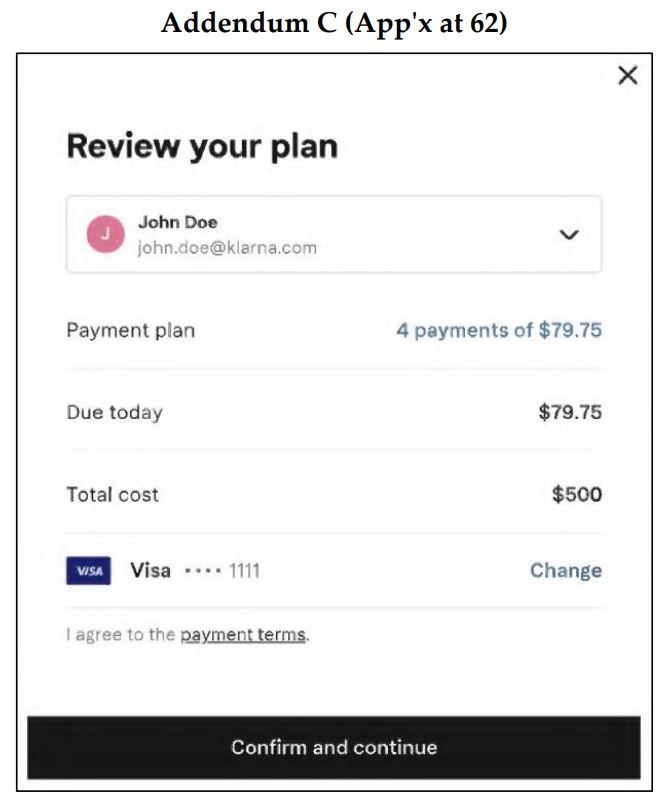
The court calls this interface “uncluttered,” with only the one reference to “payment terms” and one button (“Confirm and continue”) to click, and no scrolling required. Though the call-to-action font size is one of the smallest on the screen (why?), the hyperlink is “set apart from surrounding information by being underlined and in a color that stands in sharp contrast to the color of the interfaces’ backgrounds” (black-on-white), enough to be considered “sufficiently conspicuous.” However, the court says that arguably, “blue font is a better signal to consumers that text contains a hyperlink.”
The call-to-action is also “spatially and temporally coupled with the user’s transaction with Klarna.” Thus, “A reasonable internet user, therefore, could not avoid noticing the hyperlink to Klarna’s terms when the user selects “Confirm and continue” on the Klarna Widget….at this instance of purchase — when the user is about to receive a benefit from Klarna — a reasonably prudent user would understand that the terms presented on the interface govern the user’s future relationship with Klarna.”
But the call-to-action language is missing….any call to action? There’s no “if” part of the if/then grammar normally associated with a request for a manifestation of assent; it’s just a flat declarative statement. Though some other courts have rejected formation for the absence of an “if,” this court is fine with it:
in light of the totality of the circumstances — the overall lack of clutter on the Klarna Widget, the conspicuousness of the notice of Klarna’s terms in relation to the interface as a whole, the spatial and temporal proximity of the terms to the mechanisms for manifesting assent, the obvious fact that there would be a continuing relationship involving the payment of installments over time, and the language advising users that they are agreeing to Klarna’s terms — we conclude that a reasonably prudent internet or smartphone user would have been on notice that the hyperlinked terms were connected to finalizing a purchase on the Klarna Widget…
we have never held that “a company must ‘explicitly advise[]’ the user ‘that the act of clicking will constitute assent to [its] terms and conditions.'”
Because the call-to-action put consumers on notice, their clicks on the “Confirm and continue” constituted assent to the terms. The court notes that the consumer reached this screen only after choosing Klarna as the payment option among 6 options and entering their debit card information. “A reasonable internet user…would understand that finalizing the GameStop transaction, entering into a forward-looking relationship with Klarna, and receiving the benefit of Klarna’s service would constitute assent to those terms.”
[It’s impossible not to notice the irony that the named plaintiff transacted with Gamestop using a buy now/pay later arrangement. Maybe she was hoping that Gamestop would go bankrupt before she had to complete payment?]
So Klarna turns around the lower court loss into a fine victory on appeal. But Klarna could have improved its odds of success with some trivially easy steps:
- Proper if/then call-to-action
- Blue font for the link to the terms
- Larger font for the call-to-action
- Used a more descriptive term than “payment terms”
- Connected the call-to-action to the wording of the action button (i.e., “by clicking the “Confirm and Continue” button, you agree to our TOS”).
More generally, a second click to assent would have ended the issue, though it may not have easily been able to control that given its implementation on its merchant-partner websites. To the extent that it had complete UI control over the widget, then it was a risky move not to require the second click there.
Case Citation: Edmundson v. Klarna Inc., 85 F.4th 695 (2d Cir. 2023). The parties stipulated to dismiss the case in February 2024.