A Pop Quiz on TOS Formation–Wilson v. Triller
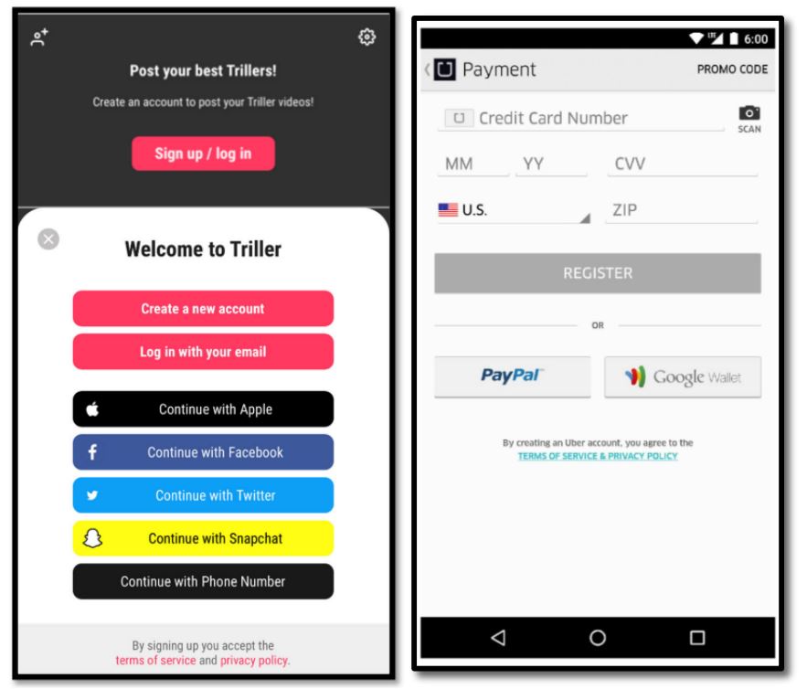
Triller is a TikTok rival. Its account formation process includes the screenshot on the left. On the right is the screenshot from Meyer v. Uber, which the Second Circuit held created an enforceable TOS. Is the Triller screen sufficiently similar to the Uber interface to get the same outcome? This is a pop quiz, so you have to answer the question before you read the rest of the post.
No fair peeking at the answer until you’ve completed your analysis. God and I will know if you’ve cheated.
OK, did you make your choice yet?
The court says….
The court explains:
As reflected in the side-by-side screenshots below, in both cases the hyperlinks appear directly below the buttons for registration in a smaller font and in a color that contrasts with the background; there is a warning that by creating an account with the respective platform, the user is agreeing to its respective terms; and the entire screen was visible at once, without there being a need to scroll beyond the page to find the terms.
Triller is lucky it got this judge and not me, because I would have ruled it OUT. The interposition of so many distractor buttons between the button and the call-to-action is materially different from the Uber interface, which is much cleaner. To me, this looks like the unsuccessful Redbox interface, which had several seemingly-irrelevant buttons between the user-selected button (like “Create a new account”) and the call-to-action explaining the consequences of selecting that button.
BONUS: The court also applies Van Buren to a CFAA claim, saying “Wilson alleges that Triller misused the information it collected about her, which is insufficient to state a claim under the CFAA.”
Case citation: Wilson v. Triller, Inc., 2022 WL 1138073 (S.D.N.Y. April 18, 2022)
BONUS 2: I.C. v. Zynga, Inc., 2021 WL 3271187 (N.D. Cal. July 30, 2021) (“the failure to include a “Reject” button does not preclude formation of the agreement”)
