If You Want an Enforceable Online Contract, You Better Keep a Good Chain of Evidence–Snow v. Eventbrite
Eventbrite wanted to send a lawsuit to arbitration, so it invoked the arbitration clause in its TOS. But did the plaintiffs assent to Eventbrite’s TOS? The court says no. What went wrong?
Eventbrite has three online venues: its desktop website, a separate mobile website, and its mobile app. Each venue has two relevant pages, the signup page and the purchase page. This means Eventbrite needs to lay the evidentiary foundation for 6 different TOS formation processes. Because each of the 6 screens are different, the court says it can’t categorically bless or reject the TOS’s formation.
The court wanted a clean chain of evidence showing the exact user interface and TOS terms for each of the 6 screens since January 2018 (the earliest that a plaintiff signed up). Eventbrite didn’t deliver that evidence.
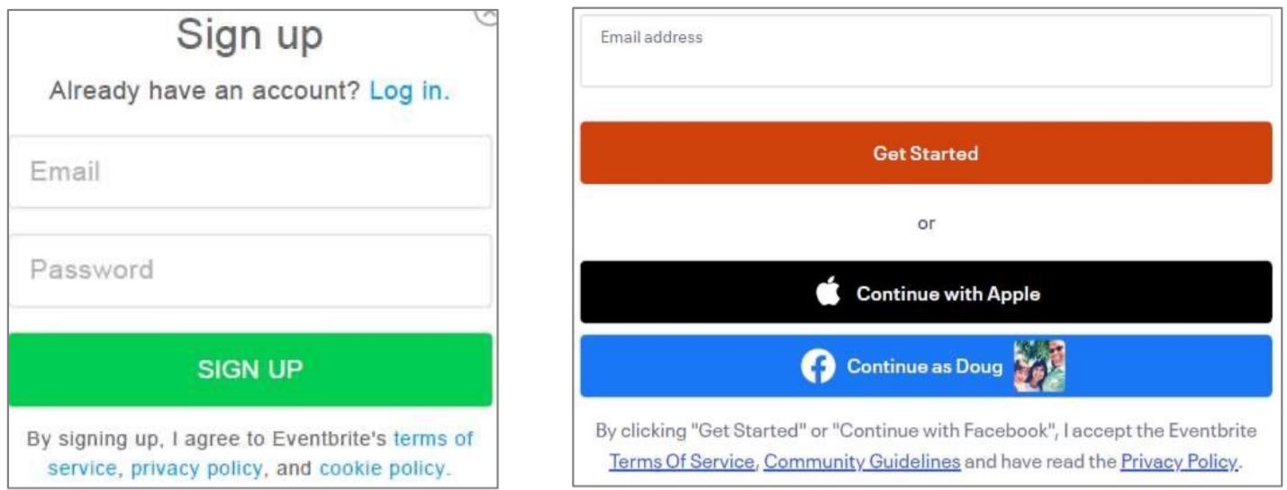
Eventbrite presented examples of how the screens looked in 2016 (left) and how they look now (right), such as:
Note that in the right-hand screenshot, the call-to-action doesn’t explain what happens if a user “continues with Apple.” An own-goal. (In my Internet Law class, I call this a “leak” in what should be a mandatory process).
Otherwise, the court suggests that these might be successful contract formation processes: “the sign-in wrap agreement is adjacent to the buttons that signal acceptance, is in a font that contrasts with the background, and displays the phrase ‘terms of service’ in hyperlink blue (and sometimes underlined as well).”
Still, the court doesn’t know what to do with this evidence because the dating (from 2016) doesn’t match the time periods when the plaintiffs signed up. To mask this, Eventbrite says that the screens looked about the same throughout the relevant time periods. This does not impress the judge because “cases have sometimes turned on seemingly small differences in design that courts have held did or did not place a reasonably prudent user on notice.”
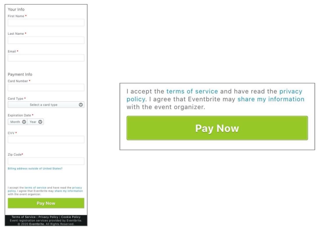
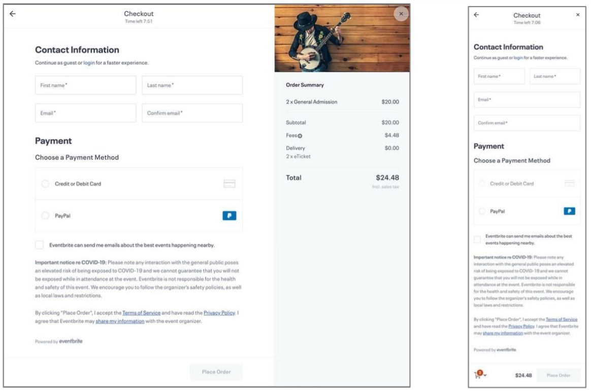
The judge also is not impressed with Eventbrite’s careful cropping. Eventbrite tried to sell these screenshots of its call-to-action placement:
With more context, the call-to-action looks less prominent:
The plaintiffs also argued that the “place order” button “floated” on the screen, so that it was always visible as the visitor scrolled up and down the page. If so, a visitor might have been able to fill out the form and click on the place order button without ever seeing the call-to-action. Ugh.
The court then reviews some specific TOS formation interfaces. One user allegedly signed up with this mobile web interface:
 [the righthand box is a magnification of the bottom of the left box]
The court says this interface could form the TOS:
If this sign-in wrap agreement is what Snow truly saw, it is sufficient to put her on notice. The message that states “I accept the terms of service” is directly above that Pay Now button, meaning that Snow had to scroll past it to press the button. It was also positioned close to the button. The words “terms of service” appear as a hyperlink to the TOS itself. That hyperlink is blue, while the text around it is gray. There is nothing about the text that would make it inconspicuous or non-obvious. As courts have held with respect to similar messages, a reasonably prudent user would be placed on inquiry notice by this particular sign-in wrap agreement.
However, Eventbrite’s declaration says only that this interface applied in 2016, not when the user signed up.
Another user signed up via this mobile app interface:
The court rejects formation in this screen:
The background of the page is black (or very dark gray) while the text “By continuing, I accept the Eventbrite terms of service” is—except for the phrase “terms of service” itself—dark gray. The operative message that clicking the button “accept[s]” the TOS is easily missed because of the lack of contrast between it and the background. The buttons immediately above the text are either brightly colored and contrast starkly with the black background (as is the case for the Apple and Facebook buttons) or use large, white text against the black (as is the case for the email address button). All of those buttons also use large, clear fonts; the text of the disclaimer, in contrast, is small. The overall impression, consequently, would lead many consumers to click one of the vibrant buttons while never knowing—and reasonably so—that the low-contrast disclaimer subjects them to the TOS.
Another own-goal.
In the end, between the own-goals and the confusion over screenshot dating, Eventbrite didn’t carry its burden to show contract formation. Motion to compel arbitration denied. This has to be a frustrating result for Eventbrite, because it seemingly snatched defeat from the jaws of victory.
* * *
What should Eventbrite’s attorneys have done differently? It’s pretty simple: attorneys need to think about changes to contract formation pages–whether it’s the contract substance or the UI presentation–as a new entry in a changelog. Each variation–no matter how minor–should be snapshotted and archived with applicable dating in a credible form of evidence. If the page has any moving parts, such as a floating “place order” button or popups or animations, the attorney should also record a video showing the animation.
While this principle is easy to state, it’s hard to implement. In Eventbrite’s case, the attorney had 6 different screens to monitor, and it’s possible/probable that the engineers could modify the UI or page functionality without approval from the lawyers. (And if there are multiple TOSes that an attorney is responsible for, this workload grows rapidly). The attorney-in-charge needs to educate those with editing power of the importance of keeping a legally rigorous changelog, so that the attorney can bless the changes and, if they are acceptable, take the snapshots of each change.
Even with a proper and authenticated changelog, Eventbrite made some own-goals. Eventbrite obviously knew how to design formation processes properly based on its other screens, and so do you. I trust you will not make the same mistake.
Case citation: Snow v. Eventbrite, Inc., 2020 WL 6135990 (N.D. Cal. Oct. 19, 2020)


Pingback: Chain of Evidence | mtanenbaum()
Pingback: News of the Week; November 11, 2020 – Communications Law at Allard Hall()
Pingback: Court Sends Wyze Labs Privacy Suit to Arbitration - Technology & Marketing Law Blog()