Redbox’s Terms of Use Fail (OUCH)–Wilson v. Redbox
Redbox allegedly sent unwanted texts to Wilson. Wilson sued for TCPA violations. Redbox invoked the arbitration clause in its TOU. The court says the TOU did not properly form and denies the arbitration request. Ouch.
Wilson joined Redbox in 2007 using its web interface. From March 2010 to December 2018, she rented 125 movies using both the web interface and in-store kiosk. In November 2016, Redbox added a mandatory arbitration provision to its TOU and emailed 120M customers to notify them of the addition. These facts gave Redbox 3 different places where it might have formed the contract: the web screen, the kiosk interface, and the amendment email. All of them fail.
The “Wrap” Nonsense
Once again, the “wrap” taxonomy provides no help. The court says “[m]any online contracts do not fit neatly into the clickwrap or browsewrap categories but instead share characteristics with both.” Naturally, that’s the case here:
the My Bag and Sign in screens are both hybrid agreements. Neither screen displays the full Terms of Use, but both make them accessible via a hyperlink. Moreover, both screens tie assent to the Terms of Use to some additional action—hitting “Pay Now” for customers using a kiosk or signing into their Redbox account for customers renting online.
At this point, why even bother with the clickwrap/browsewrap distinction if every contract ends up being a tertium quid? FFS.
The Kiosk Interface
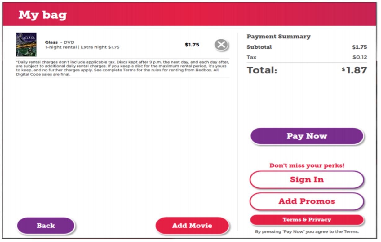
The court says this screen hadn’t changed since 2012. It is not a good design. Thinking about Specht v. Netscape, consumers can respond to the imperative “PAY NOW” without considering anything else lower on the page. The “pay now” button is well above the call-to-action, and the font size on the call-to-action is tiny. It would have been trivially easy to move the call-to-action up and make it larger.
The court says this screen “presents a relatively close call.” The call-to-action is temporally linked to the “Pay Now” button, but it is not spatially linked; plus consumer attention is diverted from the call-to-action by the two intervening unrelated buttons (“sign in” and “add promos”). The “don’t miss your perks” language implies that everything below it relates to the perks, further throwing consumers off the trail. The “back” and “add movie” navigational buttons add to the visual clutter. All of this is enough to scuttle the formation:
because the link to the Terms of Use and the accompanying disclosure were not clearly and conspicuously displayed on the My Bag screen, customers renting at a Redbox kiosk did not have constructive notice that they were assenting to the Terms of Use when hitting the “Pay Now” button
The Web Interface

Putting aside the sheer ugliness of this screen, this screen resembles a lot of screens you regularly encounter on the Internet. Maybe even pages on the sites you’re responsible for…? If so, pay close attention to the court’s discussion here.
The court again notes the temporal coupling but spatial decoupling. The court says that alone isn’t enough to cause the interface to fail. The problem is that the TOU hyperlink isn’t reasonably conspicuous:
The hyperlinks that Wilson would have encountered appear in white text, which does provide some contrast with the surrounding gray text. At the same time, other non-hyperlink text on the Sign In screen appears in white. Using a different color for the hyperlink from the surrounding text, by itself, is not sufficient to render the hyperlink reasonably conspicuous….Redbox’s failure to add some additional distinguishing characteristic to the Terms of Use hyperlink is particularly glaring here, given that the Sign In page includes two other hyperlinks formatted differently from the Terms of Use hyperlink. Both the “FORGOT PASSWORD” and “JOIN REDBOX PERKS” hyperlinks feature characteristics that distinguish them from other text on the Sign In screen….the Court finds the gray disclosure text surrounding the hyperlinks not reasonably conspicuous because there is insufficient contrast between the gray text and the black background
In retrospect, the call-to-action formatting looks obviously suboptimal. It’s not that hard to do a better contrast than light grey on black, and the call-to-action font size should never be the smallest font on the screen. That’s just playing with 🔥🔥🔥.
The Amendment Email
Because Wilson never consented to the TOU in the first place, the email had nothing to amend.
Implications
I have to assume Redbox will appeal this decision. The court went out of its way to invalidate screens that are pretty standard, so I could see Redbox feeling like it might get a different outcome on appeal.
Having said that, the court’s analysis isn’t crazy because Redbox’s execution left so much to be desired. Fixing both screens would be trivially easy to do. The case implies that Redbox hadn’t been actively maintaining these screens. Don’t be like Redbox. At the moment, Redbox probably has no TOU with any of its users–the disaster scenario that all of you are desperate to avoid. A COVID-19 lockdown is a perfect time to do a non-urgent project like refreshing the TOS signup pages.
If this case stands, it’s a wake-up call to the industry. I’ve been recommending 2-click contract formation processes for a while–a click agreeing to the terms, plus a separate click to proceed to the next screen. Any formation process with less formality leaves room for a court to peg the process as a “hybrid” wrap, at which point all bets are off. Your engineering and marketing teams might push back on 2 click, but they are basing their opposition partially on outdated expectations of online contract formation law. Courts have been progressively raising the bar for formation in the past few years, so you should have plenty of good caselaw to cite about why you need a more formal process than would have been perfectly adequate a few years ago.
This opinion dodges the question of whether Redbox could have properly amended its contract to add the arbitration clause. As you can see, a successful cutover like that is an advanced project. You need the right legal foundation, then you need to implement the amendment precisely. Botch either, and the amendment didn’t work.
Case citation: Wilson v. Redbox Automated Retail, LLC, 2020 WL 1445622 (N.D. Ill. March 25, 2020)
BONUS CONTENT: A few other online contract cases that have caught my eye in the past 9 months:
* Card v. Wells Fargo Bank, N.A., 2020 WL 1244859 (D. Ore. March 16, 2020):
Because Wells Fargo contends that its agreements and disclosures were merely linked, it was not a pure clickwrap agreement, although because there was purportedly an acknowledgement, it also is not a pure browsewrap agreement. Even if the Court were to find that Plaintiff did click on the acknowledgment of his receipt of the hyperlinked agreements and disclosures, the Court might still require further information to determine whether the digital agreement was enforceable, such as the nature of the hyperlink (e.g., how noticeable, how labelled), the placement of the agreements and disclosures and specifically the arbitration agreement after clicking on the hyperlink (e.g., a pop-up, a new browser window, how far down to the arbitration agreement, and so forth), and the placement of the acknowledgment after returning to the application webpage. Considering all the circumstances of this case, the Court finds that there is a genuine dispute of material fact regarding whether a valid arbitration agreement exists.
* White v. Square, Inc., S249248 (Cal. Supreme Ct. Aug. 12, 2019):
When a plaintiff has visited a business’s website with intent to use its services and alleges that the business’s terms and conditions exclude him or her from full and equal access to its services, the plaintiff need not enter into an agreement with the business to establish standing under the Unruh Civil Rights Act. In general, a person suffers discrimination under the Act when the person presents himself or herself to a business with an intent to use its services but encounters an exclusionary policy or practice that prevents him or her from using those services. We conclude that this rule applies to online businesses and that visiting a website with intent to use its services is, for purposes of standing, equivalent to presenting oneself for services at a brick-and-mortar store.
* Henricks v. Flywheel Sports, Inc., 2020 WL 1285453 (S.D.N.Y. March 18, 2020):
the “Terms and Conditions of Service” hyperlink is in distinctive blue lettering that stands out to the user. It was also necessary for users to check a box to confirm that they agreed to those terms and conditions before an account could be created. The Court concludes that Flywheel’s registration page presented the company’s terms and conditions in a clear and conspicuous way. Courts in this Circuit have repeatedly held that users have assented to terms of use that are accessible via a hyperlink where the user has clicked to accept the terms of use – regardless of whether the users ever read them.
Henricks’ Flywheel profile was created in December 2014, and her declaration – in which she denies participating in the registration process – is dated May 2019. It is entirely implausible that Henricks would have any memory of whether she visited Flywheel’s registration page more than four years ago.